Page 1 of 3
Re: New Wolves Unis
Posted: Mon Aug 18, 2008 6:28 pm
by Klomp
I like the upgrade. I did see in the Wolves store that it isn't the howlin' Wolf on the back, but it still looks sharp.
Re: New Wolves Unis
Posted: Mon Aug 18, 2008 6:51 pm
by stop-n-pop
TMo519 wrote:The Minny font on the aways was tweaked. I am loving these. The blue pops off better in the Mike Miller shot. And speaking of Mike Miller, nice kicks lol.
It says in the article "There will not be a black alternate uniform this year. It is a league rule that when you introduce new uniforms, you can't wear alternates for a year." Does that mean there's plans for some black alts next season? Cause I think that'd be tight.
I asked about this and they (Wolves PR) said they are sure they will get an alt jersey back in the near future. The folks at the league office said the 1 year moritorium on alt jerseys is a marketing decision and that after that, most teams get alt jerseys. There was no acknowledgment of a plan for an alt jersey, but I think it's obvious that they will have one down the road.
Re: New Wolves Unis
Posted: Mon Aug 18, 2008 7:00 pm
by stop-n-pop
deeney0 wrote:I'm getting a large Mavericks vibe from them, though. Too much green, not enough black. Overall I have no problem with them though. Not among my favorites in the league, but far from my least favorite.
I asked about the similarities to the Mavs and Hawks jerseys during the press call and the league's VP for apparel said that there is no conscious decision to have a league-wide template for this type of jersey: piping, graphic design below the arm, etc. They did say that the modern NBA jersey is likely to have a clean front with easy-to-read lettering. This doesn't leave much room for things like logos, pictures of mascots, etc. Basically, you have 8 inches above the bottom of the short and 8 inches below the arm to put in your flashes...along with the collar.
The guy from Adidas went into the type of fabric and how this uniform has a few different technical advances fropm the past jersey, and they also made a point of highighting the wooded bordering of the old jerseys in both the sides and collar, and they did so in a way that gave it all a layered look. But the graphic design on the sides is taken from the old border and it has the trees and sky.
I really like how they put "Minnesota" on the road jerseys. I suppose "Minny" would have been a bit much

Re: New Wolves Unis
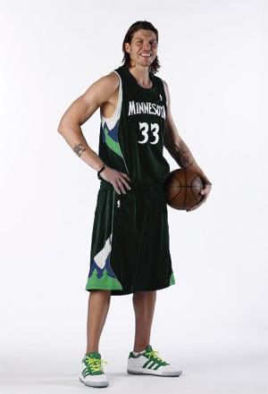
Posted: Mon Aug 18, 2008 7:14 pm
by funkatron101
Still not a fan. Al at least picked the right size. Miller is swimming in his uni.
Here it is in black.

and in green.

Re: New Wolves Unis
Posted: Mon Aug 18, 2008 7:41 pm
by Calinks
Black and green look pretty cool. I miss the "Timber" in the uniforms through. Wolves looks kind of stupid considering the fact that we are the Timberwovles, not the Wolves.
Re: New Wolves Unis
Posted: Mon Aug 18, 2008 7:51 pm
by DirtybirdGA
I dig the trees on the shorts. I like how Minny and Atlanta got away from the side panels teams like the Lakers and Spurs use, which got a little boring for me. Kindo f creative without gettin too cartoonish like some 90s uniforms.
Re: New Wolves Unis
Posted: Mon Aug 18, 2008 8:21 pm
by 4ho5ive
funkatron101 wrote:Still not a fan. Al at least picked the right size. Miller is swimming in his uni.
Here it is in black.
and in green.
Damn those both look nice! Im gonna wait awhile before i actually really consider buying one tho. I want to see how they look in action
Re: New Wolves Unis
Posted: Mon Aug 18, 2008 8:28 pm
by TrentTuckerForever
I'm disappointed... I never liked the "smiling dog" on the original 1989 uni, but I kinda liked the more ferocious wolf on last year's jersey (introduced in 1996, I think?) Maybe I'll have to change my avatar, keep the snarlin' wolf alive...
Re: New Wolves Unis
Posted: Mon Aug 18, 2008 9:05 pm
by Jase
The green and black ones are pretty sharp, too.
Every time a team gets new jerseys, the Bobcats threads look more and more horrendous.
Re: New Wolves Unis
Posted: Mon Aug 18, 2008 9:25 pm
by Basti
damn the black one would be one of the best jerseys out there. it looks really awesome. green is also nice but not as good as black.
oh and I'd like to see the unis from the backside too. I want to see the wolves/minnesota pattern on the back of the shorts as it were mentioned on timberwolves.com
Re: New Wolves Unis
Posted: Mon Aug 18, 2008 10:06 pm
by canucklife21
i thought they were not allow to have the black uni's ne more and where did the all green come from??
Re: New Wolves Unis
Posted: Mon Aug 18, 2008 10:13 pm
by ShaY
Wow guys I really like those unfiorms , maybe the best in the NBA they really look good , I wish the Rockets had something like this.
Re: New Wolves Unis
Posted: Mon Aug 18, 2008 10:29 pm
by TMo519
canucklife21 wrote:i thought they were not allow to have the black uni's ne more and where did the all green come from??
He photoshopped those jerseys. And I like lol.
Re: New Wolves Unis
Posted: Mon Aug 18, 2008 10:51 pm
by collin_k41
Wow, the black uni is probably the best looking jersey in the nba. I wish we had black and green instead of white and blue.
Re: New Wolves Unis
Posted: Mon Aug 18, 2008 11:15 pm
by Left Ventricle
those jerseys turned out way better than i thought they were going to be.
Re: New Wolves Unis
Posted: Tue Aug 19, 2008 12:00 am
by colombianbrew
deeney0 wrote:I'm getting a large Mavericks vibe from them, though. Too much green, not enough black. Overall I have no problem with them though. Not among my favorites in the league, but far from my least favorite.
My first thought was definitely "looks like the Mavs". I guess that is why the blue is so light to distinguish them a bit.
Re: New Wolves Unis
Posted: Tue Aug 19, 2008 12:08 am
by Calinks
Screw alt. Black souled be our regular road color. Green can be the alt. Screw blue!
Re: New Wolves Unis
Posted: Tue Aug 19, 2008 12:47 am
by Wingman
From the back.

Re: New Wolves Unis
Posted: Tue Aug 19, 2008 1:48 am
by C.lupus
Hmmm. That collar is even weirder from the back. I still like them overall, though.
Re: New Wolves Unis
Posted: Tue Aug 19, 2008 2:10 am
by AQuintus
I made a tiny change in the black jersey to maintain the skyline over the trees and to keep the 4 color scheme. Whether or not it's intentional in the original design, it also provided a capital "M" over the trees in the shorts.
I'm not entirely sure if I like Funkatron's black jersey or this one better.